Insightful Journey using Data Visualization
- Sarita Upadhya
- Apr 26, 2025
- 7 min read

Research says that human brain can grasp more information from data if it is represented as visuals vs numbers or values in tabular format. Advanced data visualization techniques help to visualize data in static as well as dynamic form by including facilities to filter, drilldown etc. thus making it interactive. To realize the benefits of using data visualization, we will pick up a sample data and try and seek insights from it.
The telecom industry is data rich as it is loaded with massive amount of data due to increase in the use of smart phones across different industries, geography and people of different age groups. Using analytics becomes mandatory to increase profitability by expanding customer base through targeted marketing, reducing cost with network optimization, retaining customer through competitive pricing models and increasing customer lifetime value by predicting customer churn in advance and taking preventive and corrective actions to retain them.
To get an essence of kind of information that is available with Telecom industry, below is a brief study of telecom data and way to arrive at insights using simple data visualization techniques. Data used for below analysis is available here.
About Data:
Customer Information:
• Data provided for 300 customers
• Customer ID and Customer Names are unique in this data
• Lifetime Value or the customer lifetime value represents how valuable a customer is for the business in monetary terms based on how long and how often the customer has been engaged with the business. It is calculated using a formula or it can also be predicted using customer relevant information.
Summary of Numeric Fields:

Average age of customers is around 40 years. Around 50% of the 300 customers are between the age of 17 years and 39 years with the oldest customer being 62 years of age.
Average Lifetime Value of a customer 5040383.91 IDR. 25% of the 300 customers are between a lifetime value of 180169.86 IDR and 2407104.84 IDR.
Summary of Categorical Fields:

Customers are from 10 different cities with majority of them i.e. 38 out of 300 customers from Balikpapan.
168 out of 300 customers are from Rural region.
Out of the 4 customer segments, maximum customers i.e. 84 out of 300 are from “Enterprise” segment.
Let us further explore the customers data using visualization:

In the chart Province is listed on the Y axis, colour is used to represent cities within the province and X axis depicts number of customers in each province
Customer are from a single city within a province
Minimum customers are from the province of “North Sumatra” belonging to City of “Medan”
Either “City” or “Province” can we used for further analysis as we see one to one mapping between them

In the chart, City is represented on Y axis, colour is use to represent region within the city and X axis represents the count of customers
56% of the customers (168/300) are from rural region. Rural reach of the business is more. This was observed in statistics captured in Table 2 above.
Rural and urban presence is equal in the city if Denpasar
Urban reach is slightly higher in city of Semarang

Customers are from 4 different Segments – SME, Individual, Government and Enterprise
Urban presence is more compared to rural presence in the Government segment
Rural reach is higher than Urban for the Individual segment

Chart represents the distribution of Lifetime Value across different Customer Segment using Boxplot
Median lifetime value of Individual segment is higher compared to other segments
Median lifetime value of SME is lowest compared to other segments
 |
Chart above represents distribution of the Lifetime Value of customers across different regions within the cities
|

18-year-old customer, “Customer ID: 40” belonging to SME segment is among the top 10 high lifetime value customers
5 of the top 10 high value customers belong to the Government segment
Product Information:
In all there are 50 different plans divided into 10 categories
Field “Quota” is measured in MB. It is the range of data that a subscriber can use.
Summary of Numeric Fields:

Average plan price is 93845.74 IDR. Around 25% of the total plans, range from minimum of 6703.0 IDR to 35001.75 IDR.
Quota of the 50 plans ranges from a minimum value of 7831 MB to a maximum value of 99271 MB.
Summary of Categorical Fields:

There are 4 period types used in the plan and “7 day” period is used in 16 out of the 50 plans listed.
There are 3 network types and “Fiber” is the most used network type in the plans.
Field “Bundling” with a value of “Yes/No” indicates if multiple services have been combined in a single package. 27 out of 50 plans has bundling as it a cost-saving offer.
There are 10 different categories used in the plan out of which “Category 4” is used a greater number of times compared to others.

All 3 network types have been used in “Category 4”, “Category 2”, “Category 10”, “Category 3” and “Category 5”
In “Category 4”, “Category 10”, “Category 3”, there are a greater number of plans corresponding to “Fiber” network and less plans on “5G” network
Other categories support only 2 Network Types
“Category 9”, “Category 8”, “Category 7”, “Category 1” support plans on “4G” and “5G”
“Category 6” has plans for “Fiber” and “4G” network

Median “Plan Price” is highest for plans in “Category 7” and “Category 10”
Median “Plan Price” isleast for plans “Category 5”. There is one plan in “Category 5” with a high “Plan Price” around 175000 IDR
Range of “Plan Price” for “Category 9” is lesser compared to others.

Median “Plan Price” for “5G” network is highest and that of “Fiber” network is least

Median “Plan Price” for a “14 day” plan is the highest

Plans in “Category 6” supports a smaller median “Quota” and a smaller range
Plan in "Category 2" supports higher median “Quota” and a longer range
Subscriptions:
15000 subscriptions are provided for above customers who have opted for different product plans.
Subscriptions are from the year 2021 through 2024
Summary of Numeric Fields:
Subscription discount is an additional field which is included. Average discount given on the subscriptions is around 24.96 IDR.
Minimum of 0 and a maximum of 49.99 IDR discount has been given on the subscriptions
After combining the customer and plan data with the subscriptions we can get a better view of the business.

The 1st chart shows an increasing trend in the number of subscriptions and the total revenue collected since 2021. However, the increase is not substantial.
2nd chart reveals that in 2024 the number of subscriptions for 4G has slightly increased compared to Fibre network.
As per the insights from the 3rd chart, there are more subscriptions for “7 day” plans followed by “30 day” plans.
Maximum subscriptions are from “Enterprise” and “Government” customer segments. There is an increasing trend of “SME” and “Individuals” taking the subscriptions in 2023 and 2024.

In 2024, top 5 categories with maximum number of subscriptions are “Category 4” (721), “Category 2” (559), “Category 10” (522), “Category 3” (481) and “Category 5” (403).
Hue or the colour darkness in the “Tree map” above represents that the total price collections for the subscriptions made. Darker the colour higher price collections.
The top 5 categories based on total price collection are “Category 4”, “Category 10”, “Category 2”, “Category 9” and “Category 3”.
Horizontal bar chart shows that maximum total discount was given to “Category 4”.
Out of 3822 subscriptions in 2024, only 151 subscriptions i.e. only around 4%, were from “Category 1”.
Let us further study the top 5 categories based on number of subscriptions:
Analysis of top 5 Categories

In “Category 4” many customers have tried “1 day” plan.
In “Catgrory 10” none of the customers have tried “30 day” plan
In “Category 3” none of the customers have opted for “14 day” plan
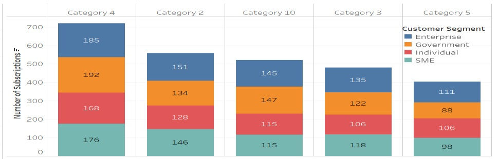
Customers from all 4 segments have subscribed in the top 5 categories

All 3 network types have been subscribed by the customers across the top 5 categories
In “Category 4”, “Category 10” and “Category 3”, Fiber network has more subscriptions.
5G network subscriptions are more in “Category 2” and “Category 5”

With the above analysis we now have a fair idea of the current business landscape and areas of opportunity for continuous improvement. Just to list few of them:
Customers are from 10 cities/provinces with a good spread in both rural and urban space.
Most of the customers are middle aged with central tendency around 39-40 years.
Opportunity to pitch in for more customers from “Individual” customer segment in the urban space.
Actions to be taken to increase the lifetime value of customers from “SME” segment.
Validate the data for 18-year-old customer who appears in the top 10 customers based on lifetime value.
There are 50 different plans across 10 different categories.
Based on the analysis of the top 5 categories done above, there is scope to simplify and reduce the number of plans for operational benefits.
There is scope for further business expansion in city of Jakarta and Medan
Quick tips on choosing charts for visualization:
➢ Explore seaborn package in Python to plot charts using different variables and combination of variables.
➢ Power BI and Tableau are also easy to use tools to plot advanced and interactive charts.
➢ Histograms, boxplots are the recommended charts to represent numeric fields while count plots and “hue” or colour options available are use to represent categorical fields.
➢ Data analysis done by sorting or aggregating values (e.g. using group by, crosstab etc.) also provide valuable insights.
➢ Restrict your chart to maximum 4 to 5 dimensions so that it does not get complicated. Use of filter, drill down approach available in advanced tools will help in covering up additional fields/dimensions.
Go ahead, pick up your business data and using the tips and following the approach like that taken-on telecom data plot charts for your data and seek insights to know the statuesque, identify areas of opportunity and address challenges by making informed decisions.


Comments